Improving engagement on a travel content platform
Context
Travel information platform for Norway
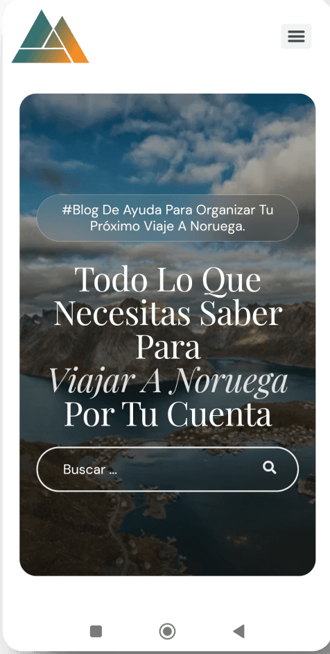
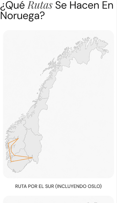
Noruega Por Tu Cuenta is a travel blog created to inspire people and help them plan trips to Norway. The product is based on informational content with organic traffic.
My role was to analyze user behavior and optimize the experience to increase time on page and interaction with the content.
Problem
Lack of user retention
Users landed on articles thanks to good SEO practices, but they barely browsed the content and quickly left the blog.
Objective
Increase time on page
Increase time on page and improve navigation depth and retention on the site by improving the amount of content and introducing a new page architecture.
The metrics that will show the goal has been met are:
- Increase in pages per session
- Improvement in time on page
- Greater interaction with the content
Research
UX analysis
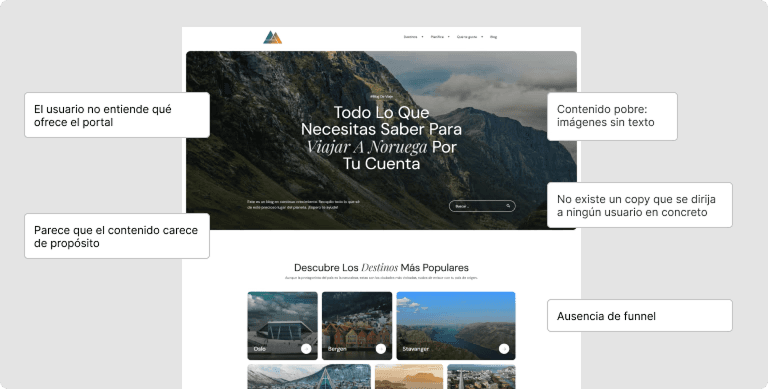
The following patterns were identified:
- Poor content: many images without text that adds value.
- That copy does not speak to a specific user or address that user’s needs
- Lack of internal linking (between articles with similar topics)
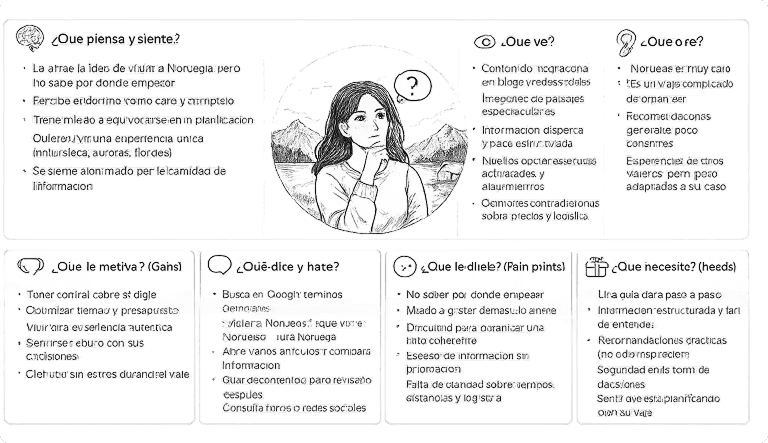
Empathy maps to understand the user persona
As a result, an empathy map was created to address the user’s pain points: how can I travel independently? is it too expensive? will it be worth it? That way, the content produced would focus on the user’s needs and pain points.
User story
Hypothesis
From the research and the findings, I was able to draw the following hypothesis.
If we improve the content structure and add elements that make navigation easier, users will stay longer on the page and interact more with the content.
Solution
Implementing user-interface improvements
Homepage redesign:
- Redesign of the homepage content structure
- Content that speaks directly to user needs
- New copy that “talks” directly to the user persona
- Use of scannable blocks
- Sections that invite further exploration (internal linking)
01.
Copy optimization to connect with user pain points and improve understanding of the value proposition.
02.
Better internal linking by suggesting relevant content and topics for the user persona.
03.
Content recommendations related to the needs and interests identified in the user persona.
Results validation
Results after the redesign
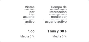
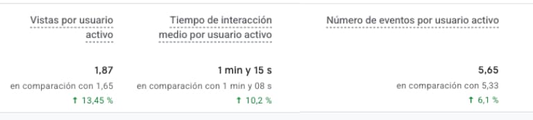
After 3 months, I used Google Analytics to check whether the design changes had moved the metrics set at the start to show if the goal had been met: increasing time on page and user interaction. The results are shown in the following screenshot.
Learnings
The results show an improvement in consumption and interaction, while scroll depth did not improve. The next iteration would focus on analyzing which content causes the most drop-off and optimizing the article structure.