Online reservation feature for TusCasasRurales.com
Client
TusCasasRurales.com
Services
Implementing Online Reservation
My role
UX/UI designer
Link to ptoyect
www.tuscasasrurales.com
THE GOAL
Implementing the online booking funcionality, allowing users to pay a deposit through the platform when making a reservation.
MY PROCESS
DISCOVER
Competitor analysis to understand industry standards and identify opportunities for implementing the new functionality.
DEFINE
Established the key requirements for the online reservation process, mapping out user flows and identifying necessary screens and elements.
DEVELOP
Created low-fidelity wireframes and designing new screens and elements for the new reservation option.
DELIVER
Developed a prototype that was tested internally by the team to identify any issues and ensure the functionality aligned with project goals.
Project Overview
The current service only allows users to contact property owners through messaging to make reservations and handle payments directly, which limits efficiency and convenience. Additionally, the platform’s revenue generation relies solely on annual subscription fees from property owners, restricting its growth potential.
This lack of an integrated booking and payment system frustrates users who prefer seamless, automated transactions, while also is stopping the platform to scale and diversify its revenue.
Implementing an online booking system with integrated payment processing would not only improve the user experience by simplifying reservations, but also create a new revenue stream for the platform.
Currently, travellers can only send a message to property owners
discover
Benchmarking
During the benchmarking phase, I analyzed competitor websites to evaluate their online booking processes, identify best practices, and understand how competitors manage key steps. I focused on understanding the booking flow, information architecture, and content on each screen.
I gathered the following ideas to apply:
Removed the tab system from the accommodation page—achieving a more linear user flow—
Removed the links from the menu and footer so that the user stays focused on the payment process.
Made it easier for users to log in by creating a pop-up window, so they don’t have to leave the reservation process.
Broke down the tasks into an accordion layout and wizard to help users know exactly where they are in the process.
Simplified the pricing screen to make it easier to choose, and to make the information clearer, especially when it comes to accommodations with multiple rental units (like divisible spaces).
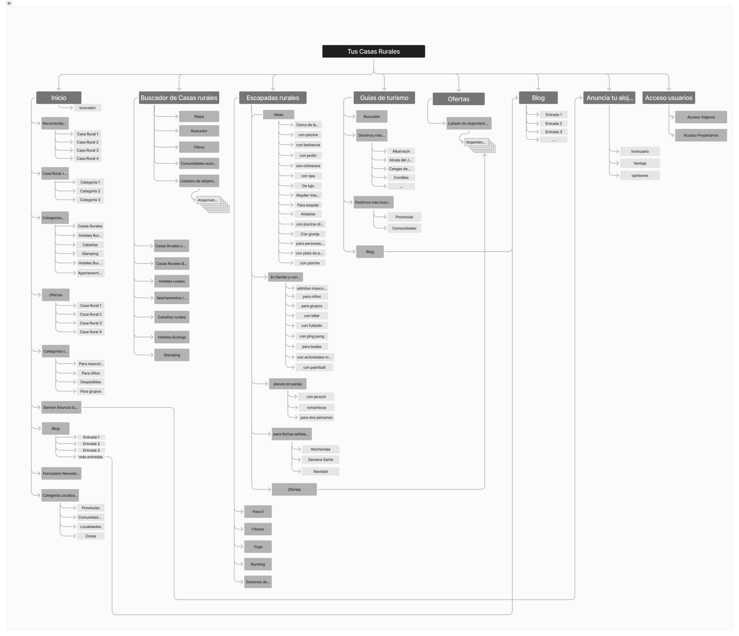
Mappin the site
First, I developed the information architecture to gain a clear understanding of the site’s structure. I did this to ensure that the new functionality would integrate smoothly without disrupting the existing user experience. After mapping out the architecture, I decided where to accommodate the new online feature.
DEFINE
Integrating the online reservation flow.
USER FLOW
I draw the two user flows for when users select the accommodation they’re stay in. There are two different paths: either they send a message to the property owner (the old method) or proceed to make a reservation (the new method). Both options will be available on the site, depending on whether the accommodation offers the ability to reserve online or requires sending a message to the property owner.
TASK FLOW
Next, I detailed the user flow for making reservation. To further define the specific requirements of the reservation process, I created the task flow, mapping out each user action and decision point is needed to achive the reservation.
Defining the scope
Once I understood the requirements of the new functionality, I created a list of the new screens and elements for the online reservation process.
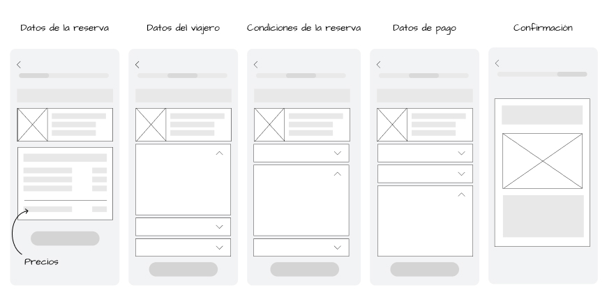
New screen for the reservation process (accordion):
Login or Signup (pop up)
User information/ Contact details
Reservation conditions
Payment screen
Confirmation screen.
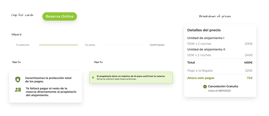
New ui elements for the online reservation.
Oline Reservation chip for cards
Reserve Button
Wizard
Breakdown of price (deposit + total)
Alerts
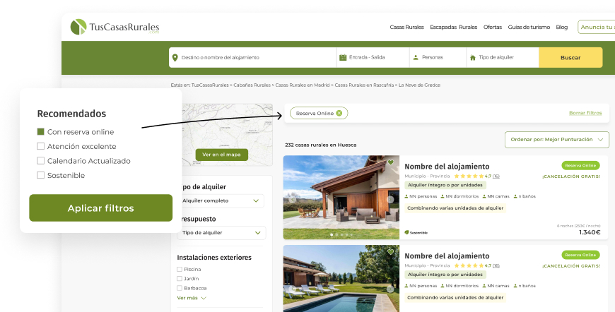
New filter
New filter under the category «Accomodation with online reservation»
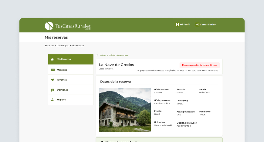
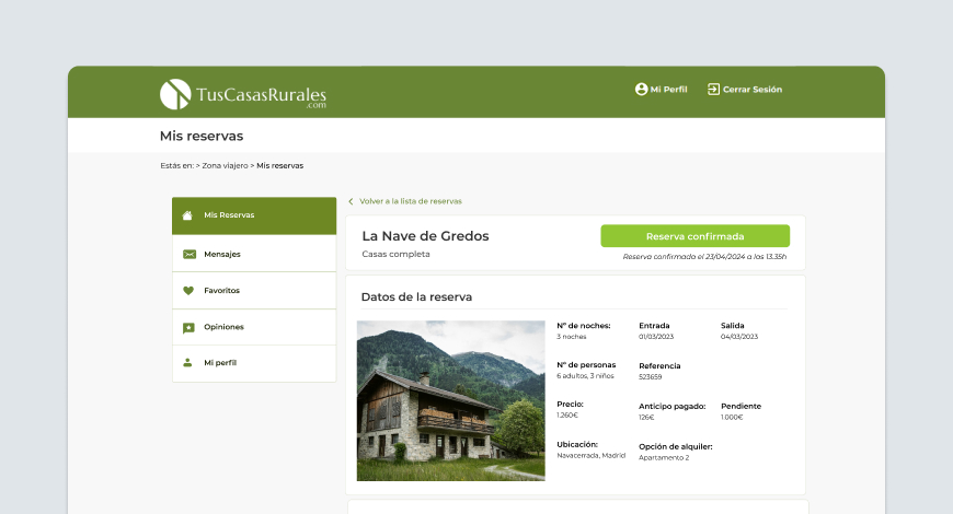
New section «Online reservation» in the Traveller private area.
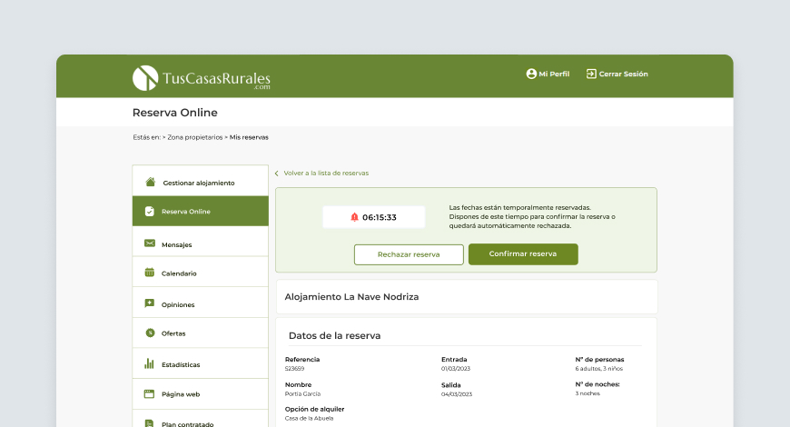
New section «Online reservation» in the Property Owner prive area.
New section under the category «Accomodation with online reservation» on the home page.
DEVELOP
Designing the interaction
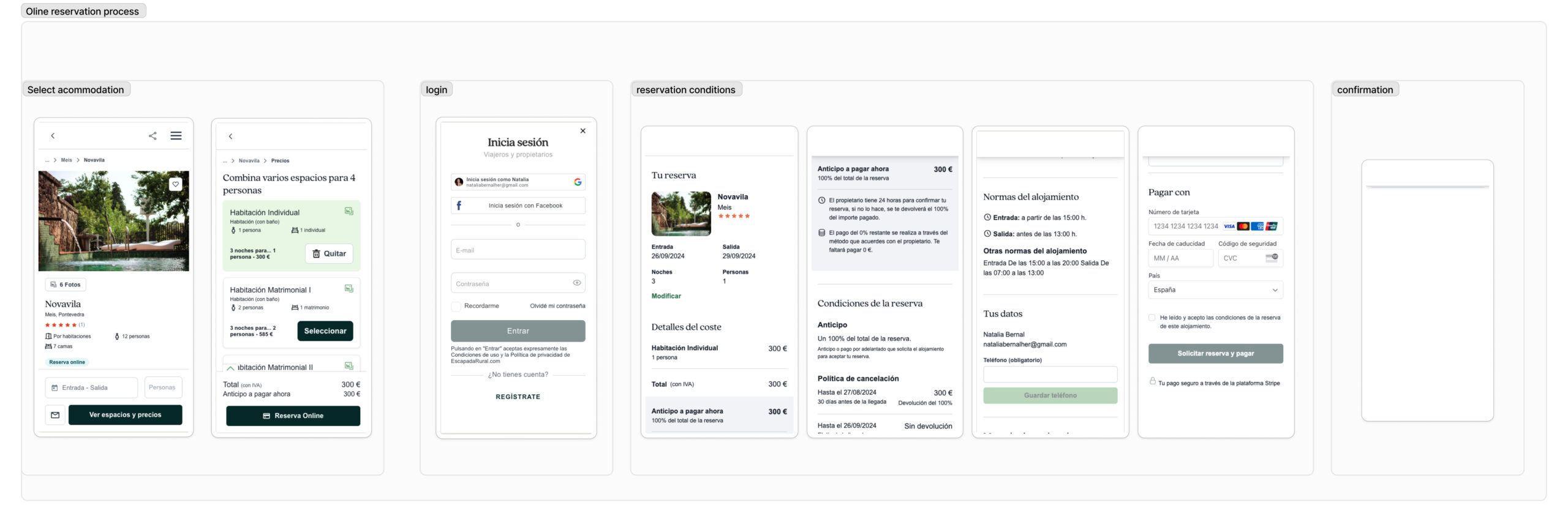
I designed low-fidelity wireframes for the new online reservation process screens, including a new table for prices (deposit and payment upon arrival), travelers’ information, such as personal details and credit card data (collected through an accordion-style form) and confirmation page.
Final screens
New UI elements
I’ve introduced new features like chips to include on the acommodation cards, wizard to guide users through each step, and the price table has been updated to to show separately what you pay now and what you pay when you arrive.
New filter Online Reservation
I´ve added a new filter that lets users search specifically for accommodations with online reservations.
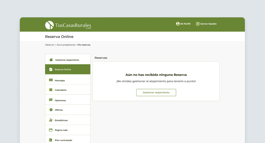
Travellers private area
These interfaces allow travelers to manage their bookings, see reservation status, and communicate with property owners.
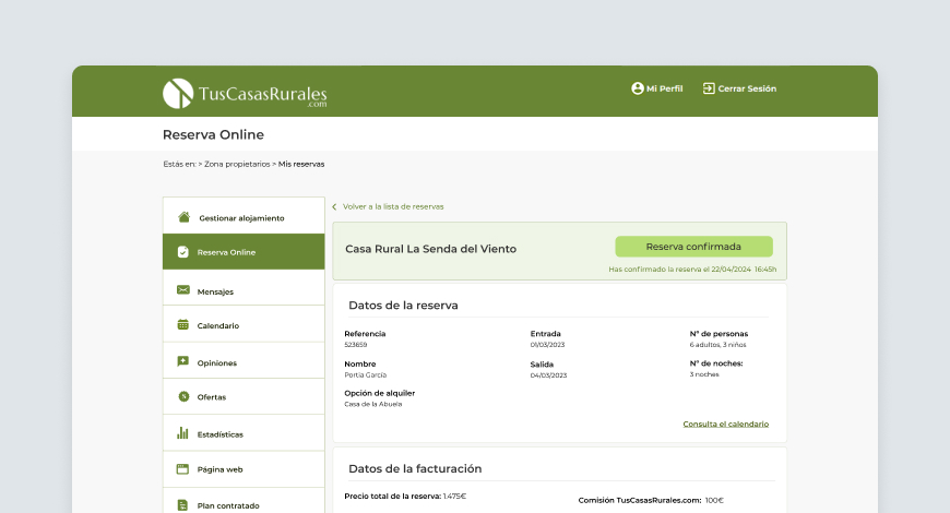
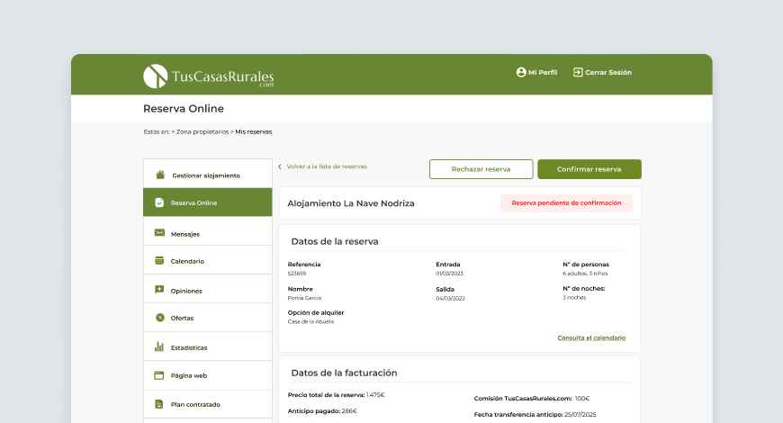
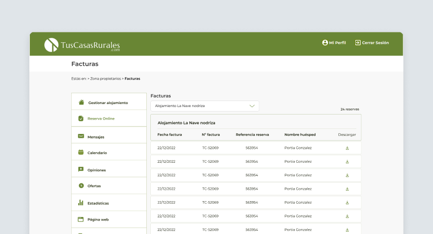
Property owners private area
These interfaces were added to the private area – which already exist – and allow property owner to manage reservations (confirm or reject reservations), communicate with travellers, handle payments and visualize invoces. Also we made a new page to sign up in the Online Reservation option.
DELIVER
Using the prototype to learn and improve
Afetr designing, I developed high-fidelity prototype using Figma for the reservation process workflow. This prototype was used for usability testing with stakeholder and his team.
For the moment, our decisions were mainly based on the team feedback, and we have not yet conducted user testing with real users.
Conclusions
Some accommodation owners prefer to pay a fee based on the number of bookings instead of an annual fee. Because of this, many have not signed up for the portal. With the new online booking feature, we can offer a pay-per-booking system for these property owners. This is expected to increase the number of accommodations listed on the portal, giving users more options and making the portal more competitive.
On the other hand, based on industry benchmark data, a 20% increase in the conversion rate of visits to bookings is anticipated following the implementation of the online booking functionality.