Tus Casas Rurales is a leading rural accommodation site in Spain.
Client
TusCasasRurales.com
Services
UI kit creation
My role
UI designer
Link to ptoyect
www.tuscasasrurales.com
what´s THE GOAL
Redesigning the User Interface to improve the consistency and usability
MY PROCESS
RESEARCH
Performed an in-depth analysis of the site, including a benchmarking study to understand how it compares to competitors and identify areas for improvement.
DEFINE
Established the foundations for the redesign, and using atomic design method to create reusable interface elements to ensure consistency and scalability.
DESIGN
Designed the entire user experience of the site, focusing on user flow, interaction patterns, and visual aesthetics to create a cohesive and engaging interface.
PROTOTYPE & TESTING
Developed interactive prototypes and conducted usability testing to refine the design based on user feedback before final implementation.
Project overview
TusCasasRurales.com led travellers find rural accommodation. The platform allows property owners to advertise rural accommodations for free, with an option to pay an annual fee for improved positioning on the site. Travelers can browse the site, register, and contact accommodation owners directly to finalize their bookings.
However, the current version of the portal, developed in 2020, lacks a cohesive design system, UI kit, or style guide, which results in inconsistent and slow implementation of new features as online reservation.
Goals
Consistency: Create a UI kit to ensure a consistent and scalable interface across the site.
Modernization: Update the interface to a more modern, clean, and intuitive design.
Mobile Optimization: Improve the mobile experience to increase user engagement and the percentage of successful contacts between travelers and property owners.
User Usability: Enhance the overall user experience by eliminating inconsistencies and improving navigation and functionality.
DISCOVERY
Research
Screen Analysis
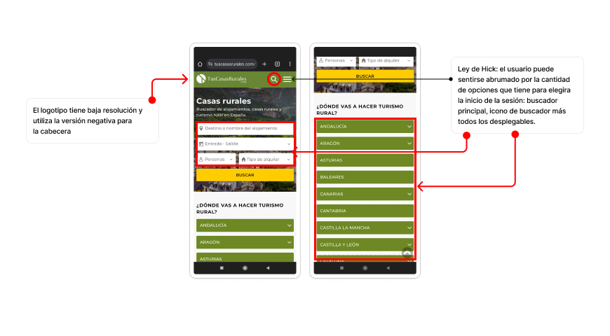
My first step was to analyze the current interface and then be able to identify design inconsistencies and bad user experience patterns.
So I took screenshots from the mobile device, considering the mobile user experience is the most seen by user (accounting for 84% of users).
From the analysis of the screens, I gathered the following insights:
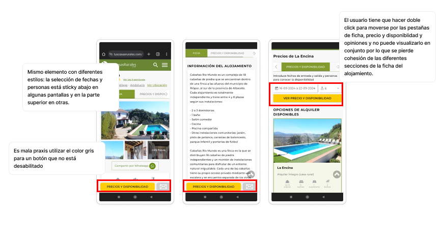
Inconsistent Design Elements: Varying button styles, fonts, and color schemes across different screens.
Poor Navigation: The search functionality was difficult to use, with cluttered search filters and unclear categorization.
Low Visual Hierarchy: Important information like pricing and availability is not emphasized, making it hard for users to make decisions.
Ineffective Contact Process: The process to contact property owners is cumbersome, leading to a high drop-off rate.
Desk Reasearch & Benchmark
I also checked www.cssstats.com to analyze the site. This tool provides analytics and visualizations from the stylesheets and helped me to identify inconsistency. For example, there´s 4 type of greens for the brand color, 32 different colors for typography, 15 types of shades, 11 types of round corners or 25 font sizes.
Benchmarking the competitors
I researched competitors interfaces going through the whole user journey. I observed every screen and how the information is divided and presented from «searching an accommodation» to «making the reservation». I took ideas to ensure that users have a smooth and understandable flow.
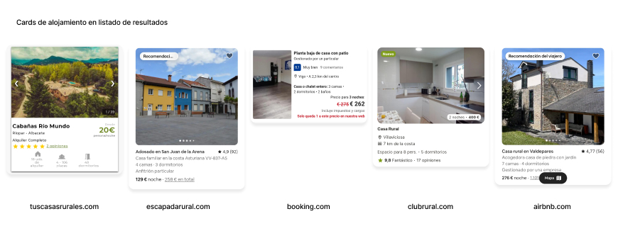
Here I gathered screenshots from the accommodation cards on the results page and compare how and what information is shown on each of them:
Here I compare the accommodation page:
These type of sites have a high number of accomodations with a lot of important information on each of them so it´s important to show the information clearly to users.
After the research, I found the principle of ‘progressive disclosure’ to be appropriate, ‘revealing’ the accommodation information as the user gets deeper into their interest in a specific place. The design should resemble Airbnb (more clean) rather than Booking (more crowded). Finally, the team agreed to continue organizing the content as it had been done at the moment.
DEFINE
Creating the fundations
After analyzing the user flow and gathering all the aspects that could be improved in the interface, I began to carry out the new redesign starting with the bases: establishing the grids and specifying colors and typography.
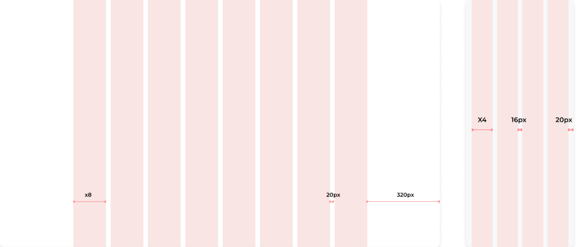
Grids
One of the main improvements is to create consistency in spacing and improve negative spaces and margins. The current grid is 1248.250px width and the responsive margins are only 10px.
Colors
This brand hasn´t a style guide neather a brand book so I base my decision on the logo, the typography style and other elements from the website.
What is very recognizable from this brand is its dark olive green so I knew it has to be present and be the main color. I also preserved the yellow for the primary button and small details but change it from pure yellow to a more natural and desaturated yellow.
I took the secondary color from one of the three color of the logo. It´s a lighter green that contrast the main one.
Neutral colors weren´t establish before so I made a grey palette to give consistency to borders, dividers, backgrounds, some text, etc
Other softer shades of green were chosen for backgrounds and boxes.
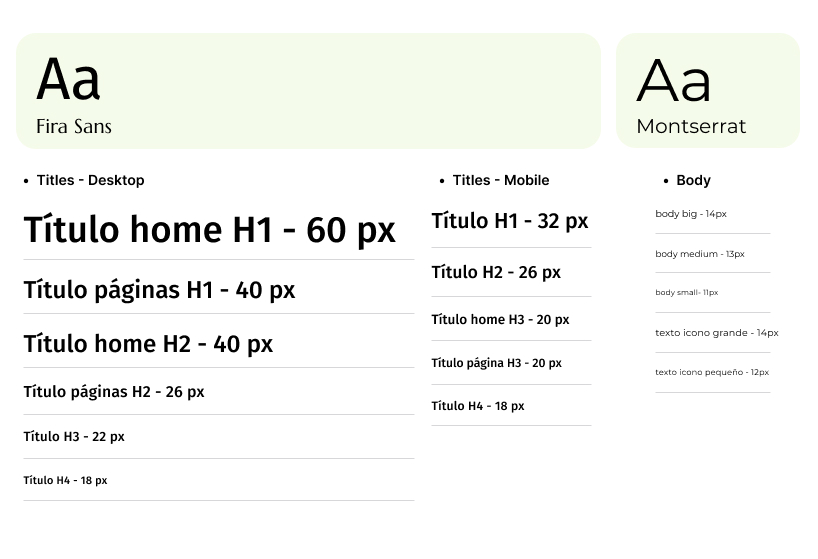
Typography
Base on the client decision, for the redesign of the site Montserrat typography is preserved and Marcellus is introduced for big titles and subtitles (h1, h2, h3) To achieve hierarchy within the accommodation cards, different weights are applied.
design
Atomic System
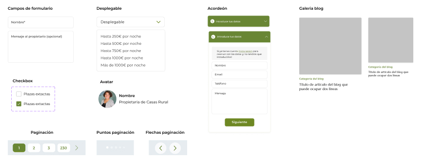
Atoms
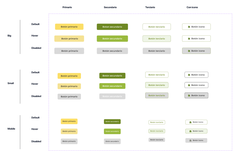
Buttons
There are 3 types of buttons: primary, secondary and tertiary (gosh button). And another variant for this last one with icon
Icons
Icons are solid and have the main corporate color fill style.
Tags
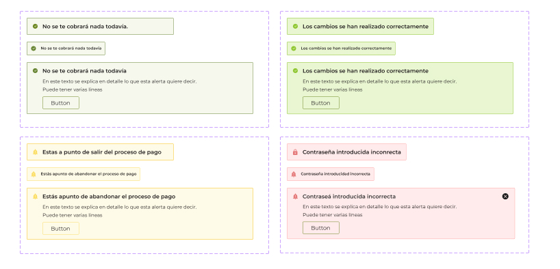
Molecules
Snackbar
Organism
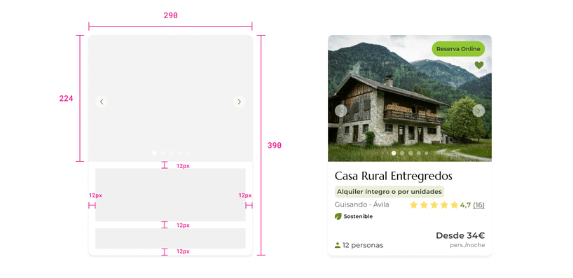
Horizontal accommodation cards (desktop)
Vertical accommodation cards (mobile)
PROTOTYPING & TESTING
Using the prototype to learn and improve
I developed high-fidelity prototype using Figma. These prototype was used for usability testing with TusCasasRurales team, not with real users and help to see some error or cases not seen before.
Conclusions
This project was very challenging for me. On one hand, I was the only designer, and I had many doubts during the process that I couldn’t share with anyone on the team. On the other hand, the tasks were communicated gradually (almost screen by screen), and the project’s goals weren’t clearly defined from the beginning. As a result, the project took more than a year and a half and it´s still been redifine. Now it is about to be started by the developers.