Create an app to provide delivery services to heal from hangover
MY PROCESS
THINKING
Research user needs and existing services to identify the demand for a premium at-home IV therapy service for high-income professionals.
BUILDING
Create a prototype with essential screens and a modern design for a simple, efficient user experience.
TESTING
Manuel’s feedback validated the app’s usability and suggested a web-based solution might be sufficient.
Context
This is a personal project that came from a conversation with a friend who works in healthcare. He mentioned that it could be a good business idea to offer an at-home IV drip service for people with a high income, who have very active social lives, often drink alcohol, and at the same time, have demanding jobs during the day.
This conversation gave me the idea to create a premium home IV service app.
Design process
To test the idea, I chose a DESIGN THINKING process: Emphatize – Define – Ideate– Prototype – Test.
USER STORY
«When a high-income user has important responsibilities to manage during the day and feels unwell due to a hangover, they will seek out services that immediately relieve their discomfort.»
The service provides at-home IV therapy by a medical professional within 30 minutes to 1 hour, anywhere in the city of Madrid, to quickly relieve hangover symptoms.
DEFINE
Desk research
Before starting the design process, I wanted to check if this service already existed, so I conducted some desk research by searching online. These are the insights I discovered.
This service is much more established in other countries like the United States and Mexico.
In Spain, there are also companies that provide at-home IV therapy. Specifically in Madrid (direct competitors), there are two companies offering this service: thefourthwellness.com and hebedrip.com.
These companies focus their IV therapy on wellness, rejuvenation, and beauty (adding vitamins and minerals), rather than specifically addressing hangovers.
They offer an at-home service, but not on an immediate basis.
In conclusion, the existence of companies providing this type of service indicates that there is demand.
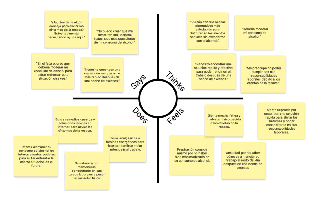
User persona
It was important to deeply understand the profile of the person willing to purchase this service. It is a premium service targeted at individuals with very specific social, demographic, and economic characteristics
Empathy map
This map helps to ensure I address their pain points effectively and offer a service that truly meets their needs
IDEATE
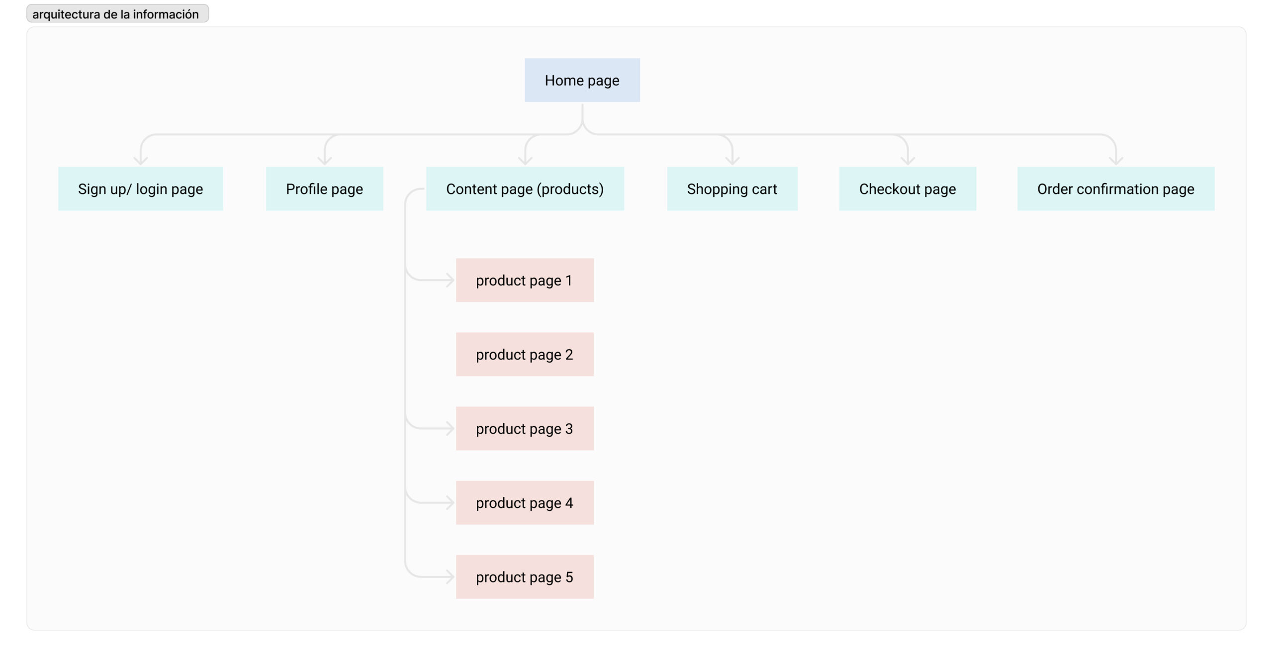
Information arquitecture
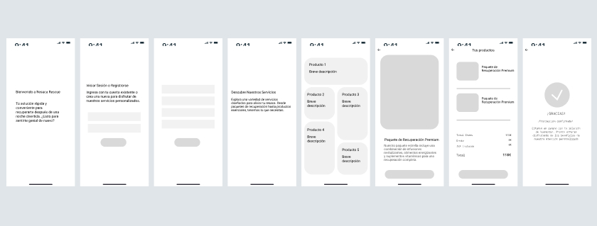
The content of the app is straightforward. It includes only the essential screens needed for a quick and easy sales process.
1. Home Screen: The home screen provides an overview of the service and products.
2. Product Screen: Users can deeply inform about the product or service .
3. Payment Screen: A secure and straightforward payment interface ensures that users can complete their transactions easily.
5. Confirmation Screen: , users receive a confirmation screen with details of the delivery service.
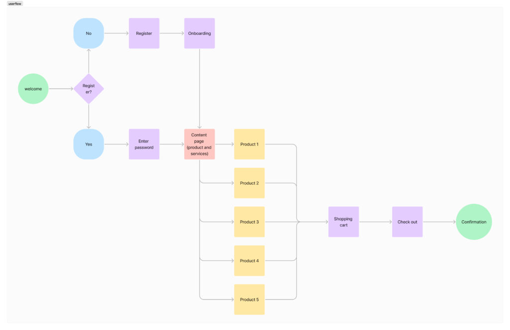
User flow
This user flow show the steps a user takes from opening the app to completing a purchase.
Onboarding: Users are introduced to the app’s features and benefits.
Selection: Users choose their service options, including IV therapy packages.
Payment: Users complete their purchase with a secure and straightforward payment process.
Confirmation: Users receive instant confirmation with details about the service.
Low & mid fidelity wireframes
Low fidelity wireframes outline the basic layout and navigation flow, while medium fidelity wireframes provide a more detailed view of elements and interactions. Both types are essential for validating design concepts and refining user experience before moving on to high-fidelity designs.
DESIGN
Moodboard
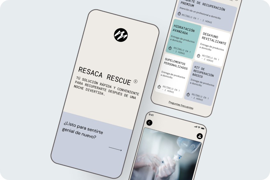
I aimed for a sleek look and feel with pastel colors, inspired by the packaging of bottles and pill boxes.
Colors
Based on the moodbord I created the color palette.
Typography
I chose monospace typography for titles to add personality and differentiation, although it’s less common in this type of context. For body text, I used DM Sans due to its excellent readability.
Final design
The final screens of the app are designed to offer a polished and user-friendly experience.
PROTOTYPING & TESTING
Using the prototype and testing with a potencial user
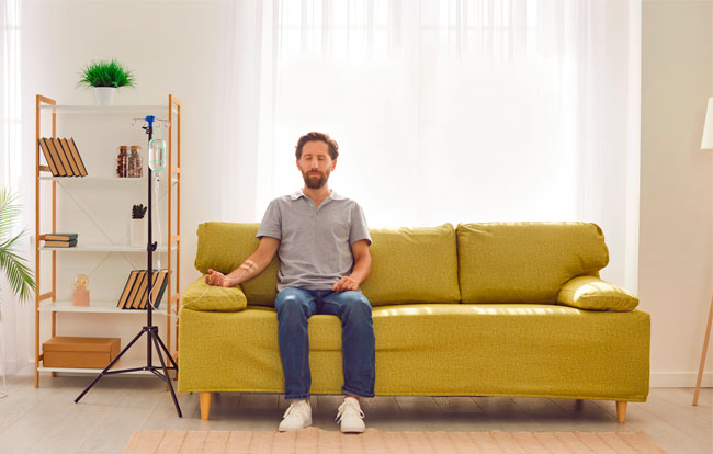
Manuel, a 39-year-old professional with a high income, who frequently goes out and drinks alcohol, provided valuable feedback on the prototype. Here are the key insights from his interaction:
Ease of Use: Manuel found the app’s interface intuitive and easy to navigate, allowing him to complete the task of acquiring a service without any friction.
Service Clarity: He appreciated the clear presentation of the service options and the straightforward booking process, which aligns well with his busy lifestyle.
Immediate Need: Manuel valued the emphasis on quick service delivery, noting that it directly addresses his need for immediate relief after social nights out.
Design Aesthetics: He responded positively to the clean, modern design and the use of pastel colors, which he found appealing and professional.
Payment Process: He found the payment process simple and secure, enhancing his overall confidence in using the app for premium services.
Overall Impression: Manuel thinks the idea is good and would be willing to use the service at a specific moment. However, he suggested that a website might be sufficient and that a dedicated app might not be necessary.